Continuing on here with the examples of the unintentional ways simplified, "easy to ready" health information doesn't meet the challenge of educating and preparing the public to better understand and take actions in complex emergencies like COVID19.
EXHIBIT #2
The Infographic
We have grown used to seeing graphically dominant posters, or “infographics” promoting and reminding people of basic hygiene messages: washing hands, staying home when you’re sick, etc. Below are two examples. The first, from H1N1 (2010), the second, COVID 19.
(H1N1 Infographic)

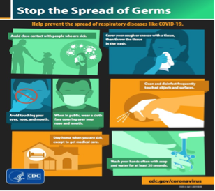
These posters are excellent at what they set out to do – promote the basic hygiene message. The message represents the hallmark role of public health and messages like this have been used since the early 1900s.

Disseminated widely, they are interpreted easily, quickly and they have a long shelf life. Until Covid you were very likely to still see the “Clean Hands” posters from N1N1 .


The WHY? Of it All
What is often not given as much attention however, including messaging ( and design) is the “why” of each of these directions.
· Why should I throw the tissue away?
· Why shouldn’t I touch my face?
Nearly everyday we hear health experts and local government officials pleading and coaxing people to “practice social distancing”. Keeping our distance is proving to be thorny if not outright contentious. We’ve called on people’s desire to stay safe, protect their loved ones, practice more civic responsibility, and be “in this together.” Libertarian ideologies aside, I think there is still so much more to do to meaningfully teach (and repeat) what we know about transmission, the efficiency of this virus, and the perils of innocuous behaviors - the WHYS of social distancing.
Amidst this tragic pandemic many experts are already reimagining a post-pandemic world. The current approaches to simplifying complexity should be re-examined. Millions who struggle with health and science concepts and information, are left with a diet of “simplified” information and piecing together sound bites from mainstream media, social media and pseudoscience then reinforced by their peers, all picking over the same sub-standard information. A recipe for contributing to health disparities.
Think of David Maccauley's The Way Things Work. A whole book of infographics!
 |
| Page from David Macaulay. The Way Things Work. Parsippany, NJ :International Playthings, Inc., 2004. |
Infographics allow us to combine various elements - text, image, chart, diagrams to present information and explain complex issues in a way that can quickly lead to insight and better understanding.

The "Galileo" of data graphics, Edward Tufte, has written and spoken eloquently and often about the fundamental importance of rendering visual information so that it conveys and teaches "forever tasks".
"...I've been ever since preoccupied with how the fundamental tasks of thinking can be replicated in our designs of information, so that our architectures support learning about causality - that's a forever cognitive task - support, that our architectures support making comparisons, which is a fundamental forever task. Our displays help us assess the credibility of a display, and how do they know that? That's a forever task."
So it's true we are calling for the public to act responsibly and intelligently for their own safety and the safety of all of us. Can simple information really do that heavy lifting? I'm not seeing it.
The goal should be to adopt better communication methods from the excellent theory and practice from reading research, cognition and information processing, information design, usability and, intramedia effects. At the very least we cannot expect people to adopt and stick with hard to do things like staying home indefinitely, social distancing and wearing masks if they’re not somewhat in on the discussion with all of us together.
No comments:
Post a Comment